Code
Use the copy button in the top left corner of the code box below to get the data needed for the practice exercies. The code below may look weird depending on the size of your screen, but regardless use the copy button then paste it into your rscript.
This is our dataset for this practice:
| gender | race/ethnicity | lunch | test preparation course | math score | reading score | writing score | parent_education |
|---|---|---|---|---|---|---|---|
| female | group B | standard | none | 72 | 72 | 74 | bachelor’s degree |
| female | group C | standard | completed | 69 | 90 | 88 | some college |
| female | group B | standard | none | 90 | 95 | 93 | master’s degree |
| male | group A | free/reduced | none | 47 | 57 | 44 | associate’s degree |
When columns have spaces in the column name (like test perparation course, math score, reading score, and writing score), you must wrap the column in `back-ticks` and not ‘single quotation marks’ to use them in R.
Examples:
test perparation course`math score`Notice how race/ethnicity is connected with a parenthese \ and parent_eduction is connected with an underscore _ . Neither need the back-ticks around it.
Remember this in the following exercises
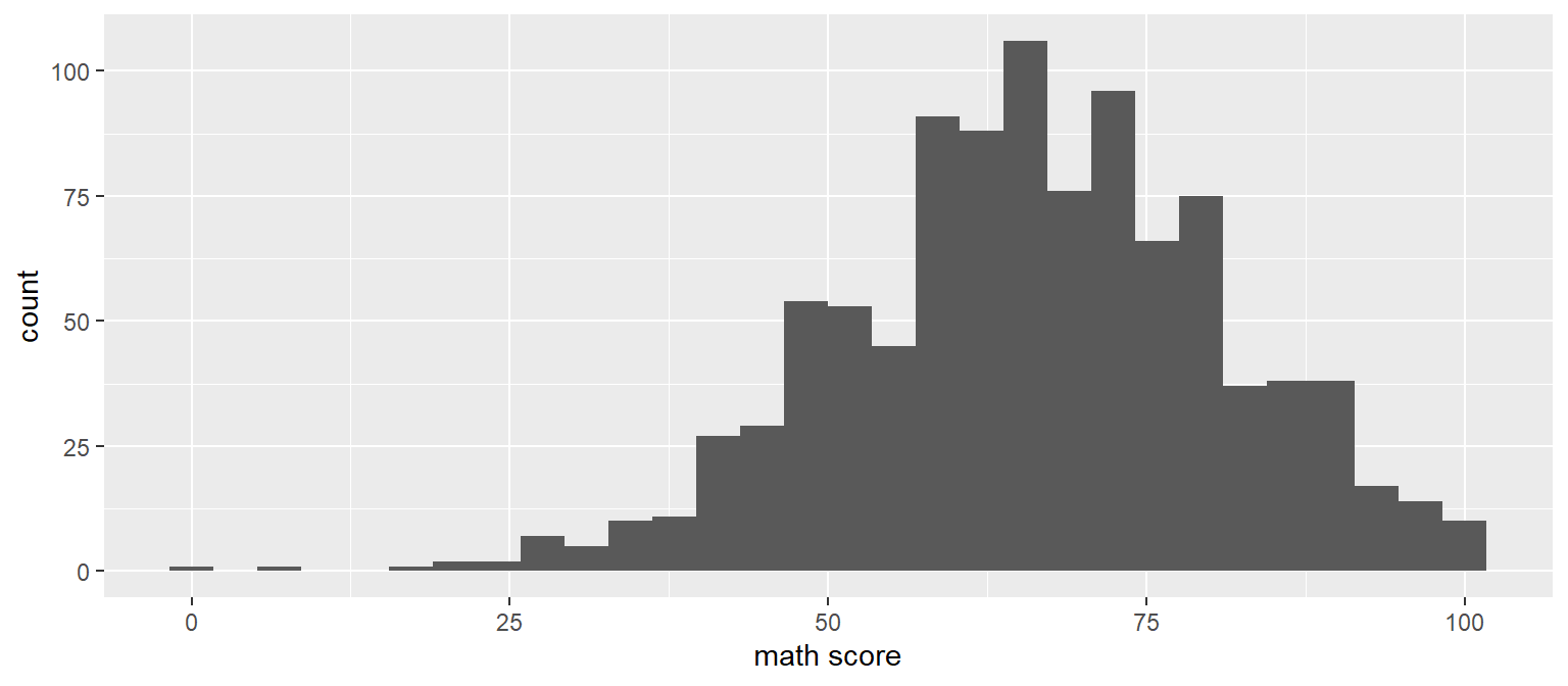
Prompt: Show the distribution of math scores
Instructions:
bobmath score` column and make sure it is wrapped in tick marks. This is necessary when column names contain spaces.geom_histogram() on line 2Starter Code:
Answer:
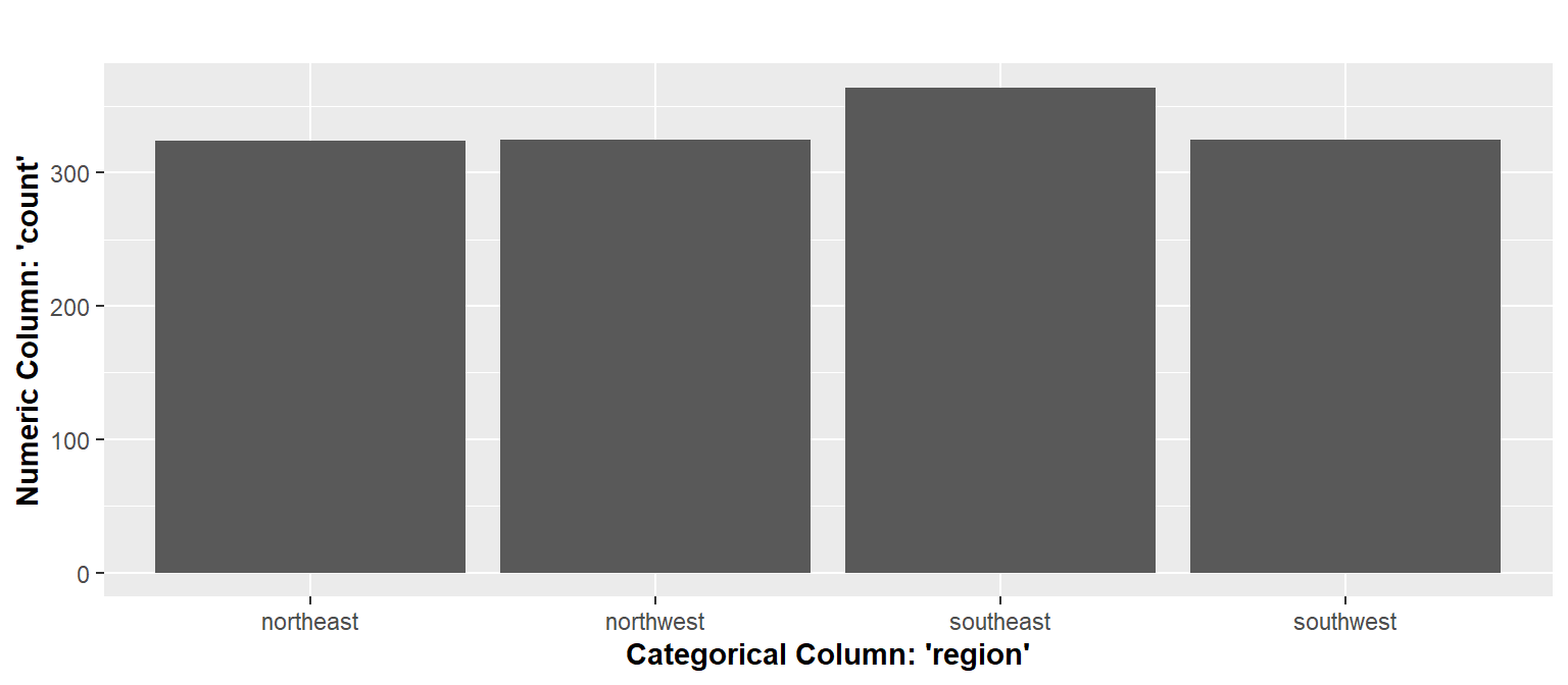
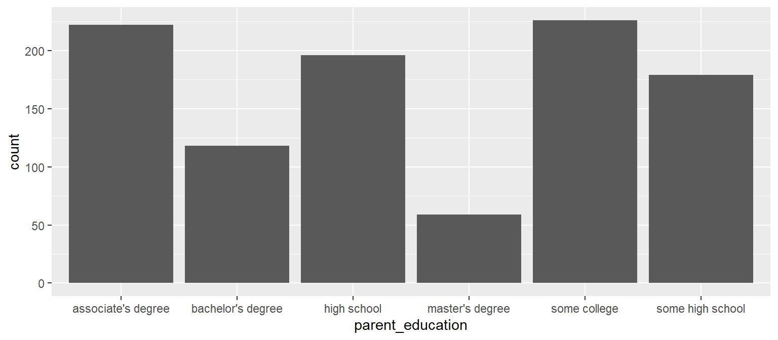
Prompt: Make a bar chart visualizing the count of school degrees
Instructions:
bobparent_education column as the x axisgeom_bar() in line 2Starter Code:
Answer:
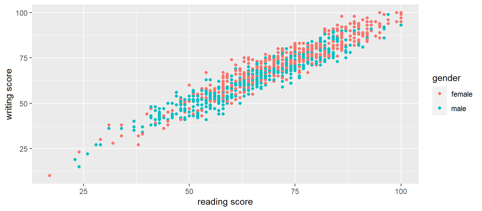
Prompt: Make a scatter plot visualizing the correlation of reading scores and writing scores
Instructions:
bobreading score` column as the x axiswriting score` column as the y axisgender column as the colorgeom_point() in line 2Starter Code:
Answer:
Prompt: Make a scatter plot visualizing the correlation of reading scores and writing scores
Instructions:
boblunch column as the x axismath score` column as the y axisgeom_histogram() in line 2Starter Code:
Notice in the starter code we didn’t specify data, x, and y. ggplot doesn’t require explicitly specifying the arguments for data, x-axis, and y-axis. Those are implied by their position in the code below. This way of writing code require less typing and is very common.
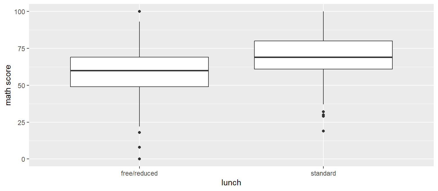
Answer:
For the remainder of the exercises, no starter code is provided. Look back at previous exercises for help if needed.
Prompt: Make a bar chart visualizing the types of lunches
Instructions:
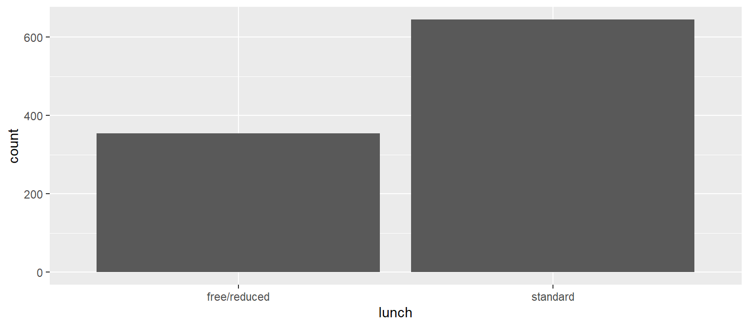
Answer:
Prompt: Using the iris dataset (which is built into R and ready to use) make the scatter plot below. Look at the x-axis, y-axis, and legend for the columns to use.
Instructions:
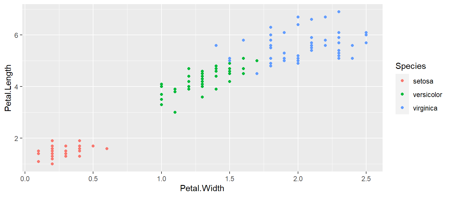
Answer:
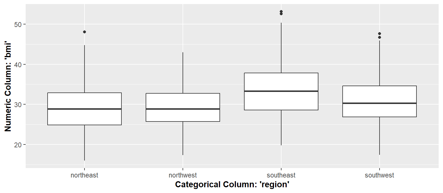
Prompt: Using the iris dataset (which is built into R and ready to use) make the boxplot below. Look at the x-axis, y-axis, and legend for the columns to use.
Instructions:
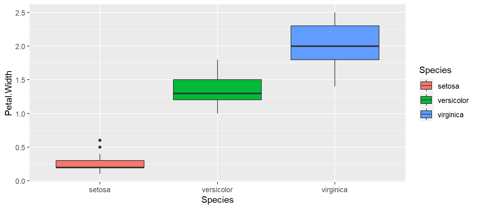
Answer:
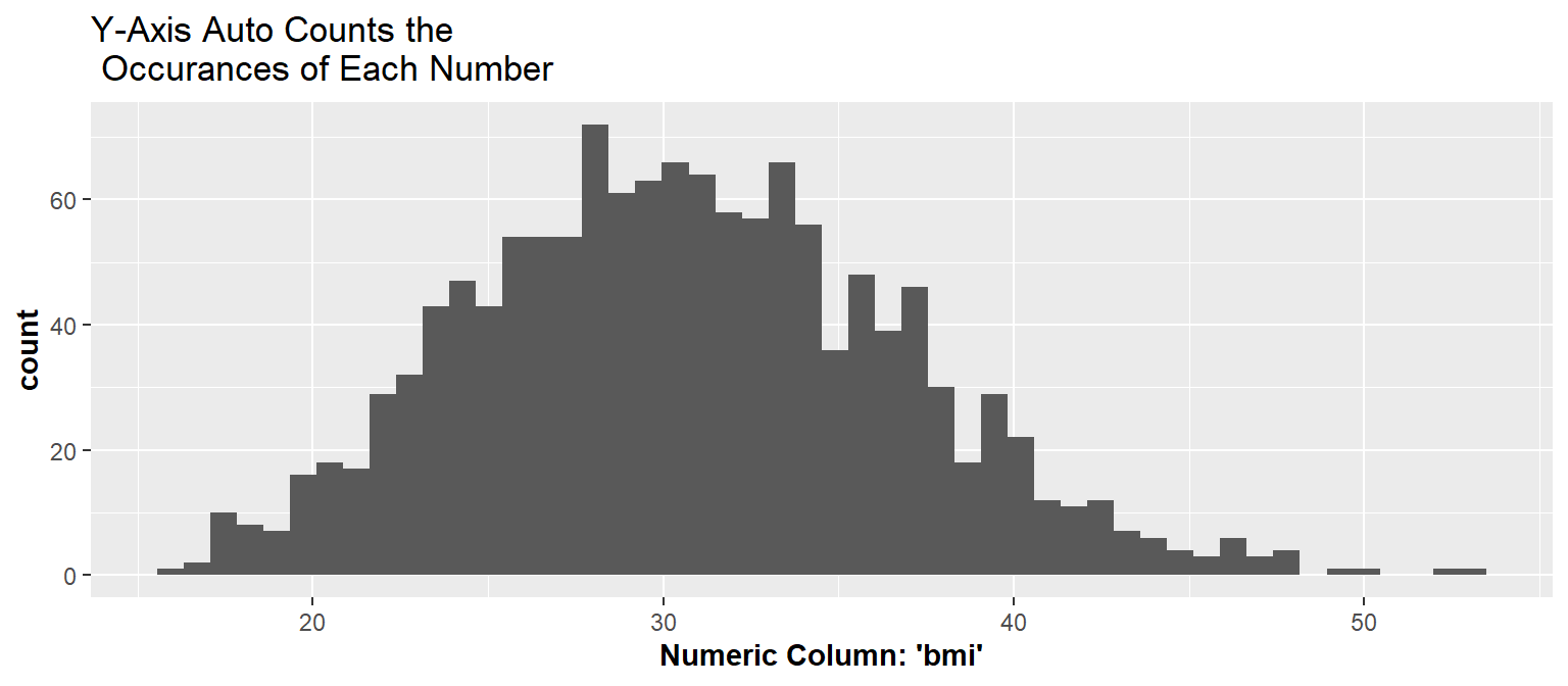
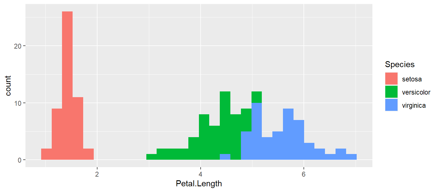
Prompt: Using the iris dataset (which is built into R and ready to use) make the histogram below. Look at the x-axis, y-axis, and legend for the columns to use.
Instructions:
Answer: